05Website development
AMD Architectural Concept Illustration
An image-led portfolio website that gives architectural illustration the lead across desktop and mobile.
Project overview
A restrained portfolio framework designed around visual work
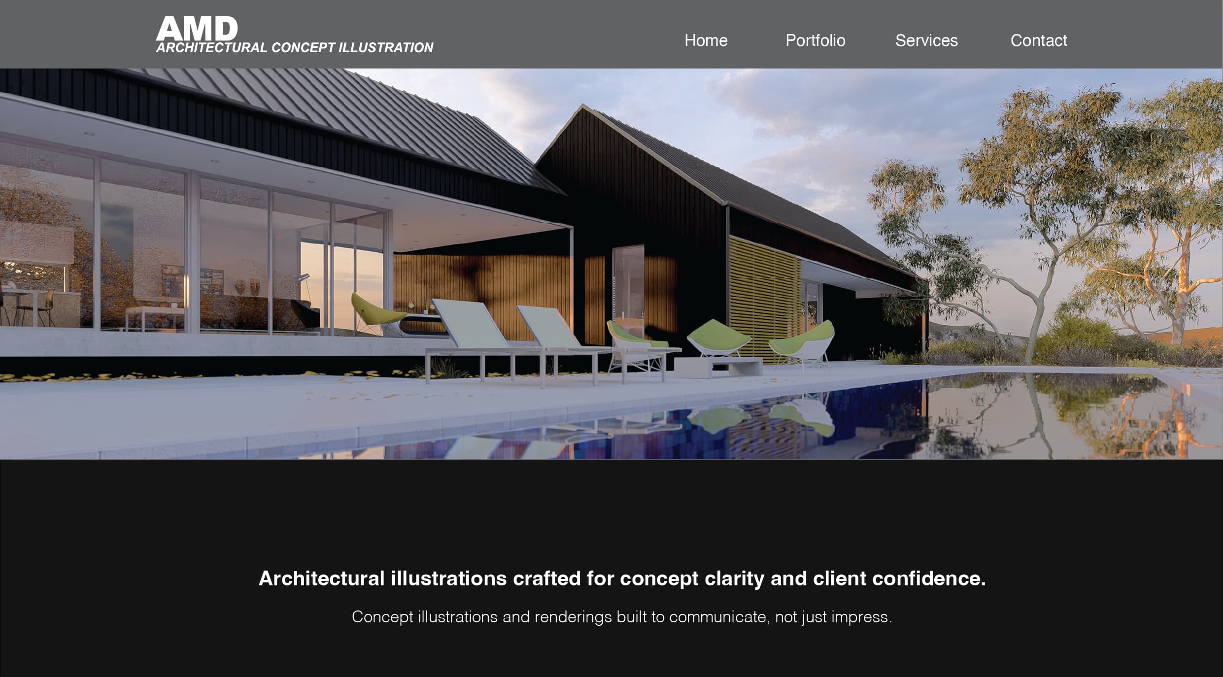
The AMD website is a restrained portfolio experience built around large architectural visuals and direct navigation. The desktop opening gives most of the canvas to a rendering while keeping Home, Portfolio, Services and Contact easy to locate.
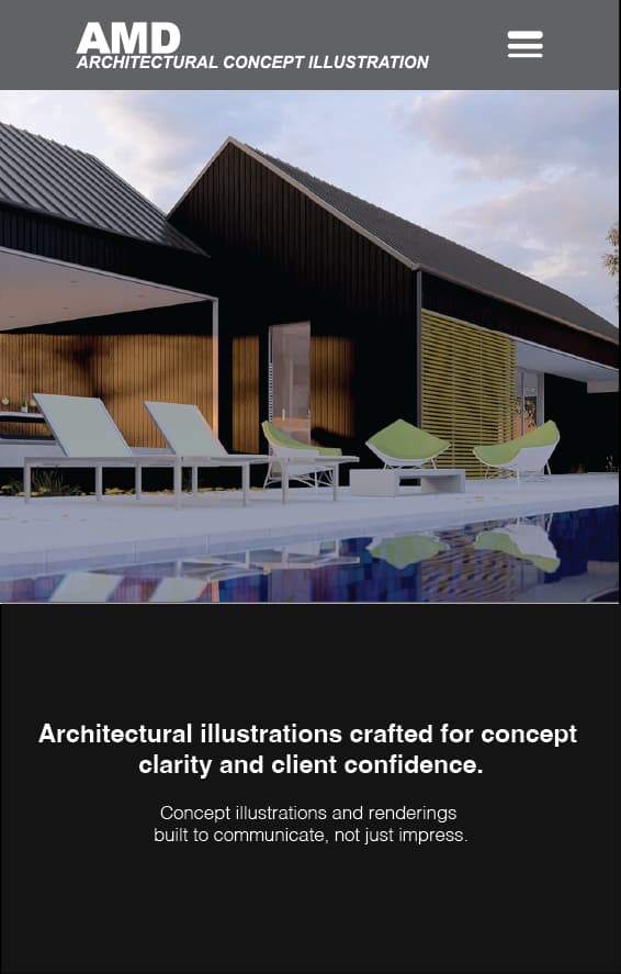
The next visible statement explains the role of the work: architectural illustrations support concept clarity, client confidence and communication. The mobile capture preserves the same relationship between identity, imagery and concise positioning.
01Portfolio direction
Letting the work lead
The opening composition gives the architectural rendering the largest share of the screen. Branding and navigation remain easy to locate, but neither competes with the image that demonstrates the character of AMD's work.
That visual priority suits a portfolio website because the subject can be understood before the visitor moves into detail. The interface acts as a frame for the work rather than another layer demanding attention.
02Positioning
Explaining the service in plain language
The section beneath the opening image gives the visual work a concise explanation. It connects architectural illustration with concept clarity, client confidence and communication, adding context for visitors who need to understand what the images are intended to do.
The statement is kept brief and given generous space. This allows the rendering and the copy to support each other: one demonstrates the work visually, while the other states its role directly.
Concept illustrations and renderings built to communicate, not just impress.
AMD website positioning
03Information architecture
A structure for viewing and enquiring
The top-level navigation separates the site into four destinations: the home introduction, portfolio, service information and contact. The structure is visible in the desktop capture and condenses into a menu control on mobile.
No approved portfolio-grid, project-detail, services or contact captures are stored in the repository. The positions below remain labelled so the real work can be added without recreating or assuming the unseen layouts.
Replace with the approved project or portfolio grid.
landscape asset slot · ready to replaceReplace with an approved architectural project page.
landscape asset slot · ready to replace04Responsive design
Translating visual scale to mobile
On desktop, the architectural image stretches across a wide canvas beneath a horizontal header. On mobile, the identity and menu share a compact header, the rendering becomes a tall crop and the positioning statement follows as a distinct section.
The hierarchy remains visible in both supplied captures: identity first, work immediately after, explanation next. Showing the views together documents a real responsive relationship without relying on unsupported claims about performance or implementation.
Project scope
What the work covers
- 01Portfolio website
- 02Image-led home presentation
- 03Desktop website interface
- 04Responsive mobile interface
- 05Portfolio and services navigation
- 06Contact path